
A key challenge in evaluating comprehensive community health initiatives is how to document and illustrate the unfolding of the intervention; that is, the multiple changes in the environment that can lead to widespread behavior change and improvement in population-level outcomes. Using online graphs, community and research partners can examine the rate of community/system changes over time, or allow for systematic reflection on the proportion of changes occurring in different sectors.
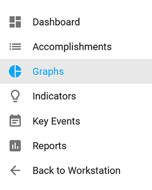
To begin, click on the Graphs link in the left navigation bar.
You will notice a Help documentation link to Graph Help in the upper right. That link will open a new window that takes you directly to this documentation.
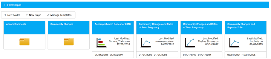
As graphs are added to the site, they will appear in an alphabetized list on the graphs page. The graphs will feature an icon representing the graph type, along with the assigned title, created or modified date, and the date range of the graph.
Click Filter Graphs if you want to select graphs by title, created or modified date, or created or modified by name.
Click on any folder or graph to open and view it.
Graph Overview
Before you create a graph you need to have the following information:
- Graph Name: Assign a descriptive name to your graph, e.g., "Services Provided - May 2023." Each graph name must be unique within the CCB, or you will receive an error message when you try to save it.
- Note: No special characters (other than a dash or underscore) can be used in graph names.
- Date Range: Adjust the range of data displayed by changing the dates shown. You can type the dates in or use the calendar picker that appears when you click within the box.
- Note: the Date Range for new graphs defaults to the current calendar year.
- Date Display: For a broader or narrower view of data points throughout the designated date range, you can change the Date Display to reflect data points by Day, Month, Quarter, or Year.
- Labels Display: Display or hide numerical labels on a graph to help identify the values shown for each data point in the data series.
- If using a Pie Chart, the additional option will exist to Show Percentage.
- Graph Type: For various presentations of your data, you can modify the Graph Type by selecting from the Graph Type icons.
When you create a new graph, the most appropriate Graph Type will be utilized by default for the data you are graphing. Depending on the data depicted and its source, you may have an option to change the Graph Type after it is created.
![]()
- Line Graph: Two types of line graphs are used to track numerical changes over periods of time.
- Non-Cumulative Line Graph: The numbers may go up or down, reflecting the actual value entered from data point to data point.
- Cumulative Line Graph: The numbers will rise as each new value is entered, adding the current value to a running total.
- Bar Graph: Bar graphs compare data between different groups or track changes within a period of time. When trying to measure change over time, bar graphs are best used when changes are larger.
- Two types of bar-graph visualizations are available: vertical and horizontal.
- Pie Chart: Pie charts are best when you are trying to compare parts of a whole or show a distribution of categories by number or percentage.
View Graphs
- Click the Graphs button on the Dashboard or Graphs in the Left Navigation Bar. You will see a display of all existing folders and graphs. Folders and Graphs are displayed in alphabetical order.
- Click Filter Graphs if you want to select graphs by title, created or modified date, or created or modified by name.
- Click on any folder or graph to open and view it.
Create a Graph
- Click on + New Graph at the top of the Graphs page
- Select the appropriate option from the Create new graph dropdown menus
- Select from the What data type do you want to graph? dropdown menu. Your options are Accomplishments, Participants Description, Indicators and Create Graph from Template.
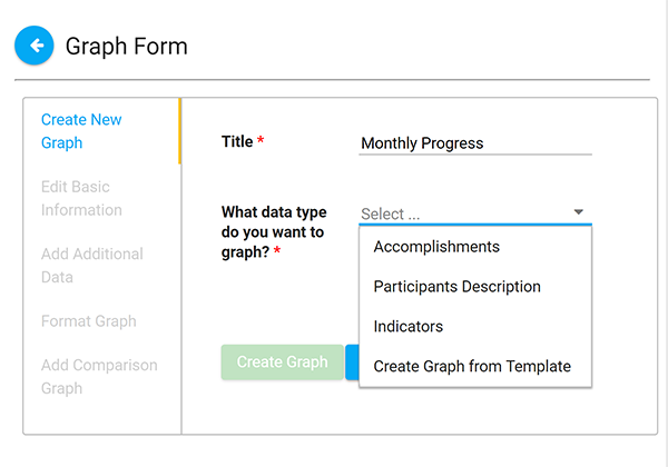
- Click Create Graph. You should see the following display, with blanks for the Title and Date Range.
- Assign a descriptive title to your graph.
- NOTE: Every graph must have a unique title. If you have multiple graphs called Accomplishment Graphs, you will need to rename them.
- NOTE: Every graph must have a unique title. If you have multiple graphs called Accomplishment Graphs, you will need to rename them.
- Adjust the Date Range by changing the default dates shown. You can type the dates in, or select dates from the calendar icon on the right. Note: the Date Range defaults to the current calendar year.
- Adjust the Date Display if needed.
- Adjust the Labels Display if needed. If using a pie graph, a Show Percentage option will also be displayed.
- Adjust the graph type if needed.
- Click Apply to save these changes.
- Click Edit to select options for the data you want to graph.
Options available after you create a graph
- When you create a new graph or open an existing graph, you will see the following options:
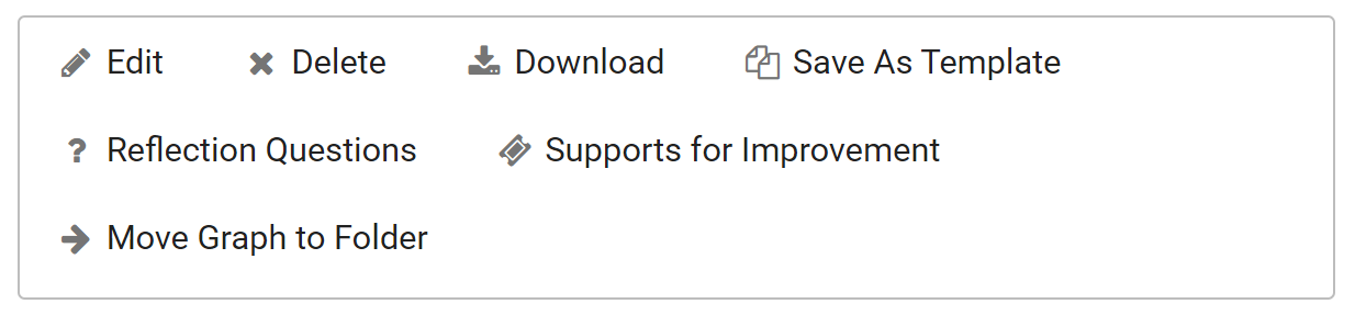
- Select the appropriate option:
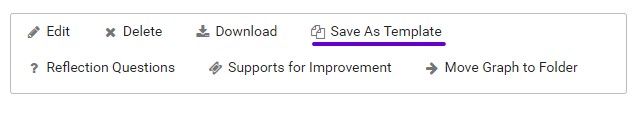
- Edit to make changes to the existing graph.
- Delete if the graph is no longer needed.
- Download to save a copy of the graph for use in presentations or other tools offline.
- The image will download as a PNG file with a transparent background. Use "Insert" and "From your computer" in Microsoft programs (for example, Word or PowerPoint) to add the image to a report or slideshow.
- Save as Template to make the graph available when working with similar data in the future.
- Reflection Questions encourage documenters to think carefully about, better understand, and communicate the meaning of their data. A default set of reflection questions are displayed based on the graph type. Please talk with your site owner or the KU researchers supporting your efforts if you need to add custom reflection questions.
- Supports for Improvement provide helpful guidance and links for solving problems and dilemmas that documenters may encounter in their work. This section displays live content from the Community Tool Box Troubleshooting Guide to assist you.
- Move Graph to Folder allows you organize existing graphs as needed.
Edit a Graph
- When you click the Edit Graph button, a new window will open with options to Edit Basic Information, Edit Data Accomplishments, Add Additional Data, Format Graph, and Add Comparison Graph. Click the category you want to edit, and then type in the new information.
Edit Basic Information
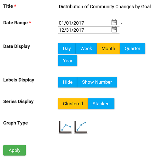
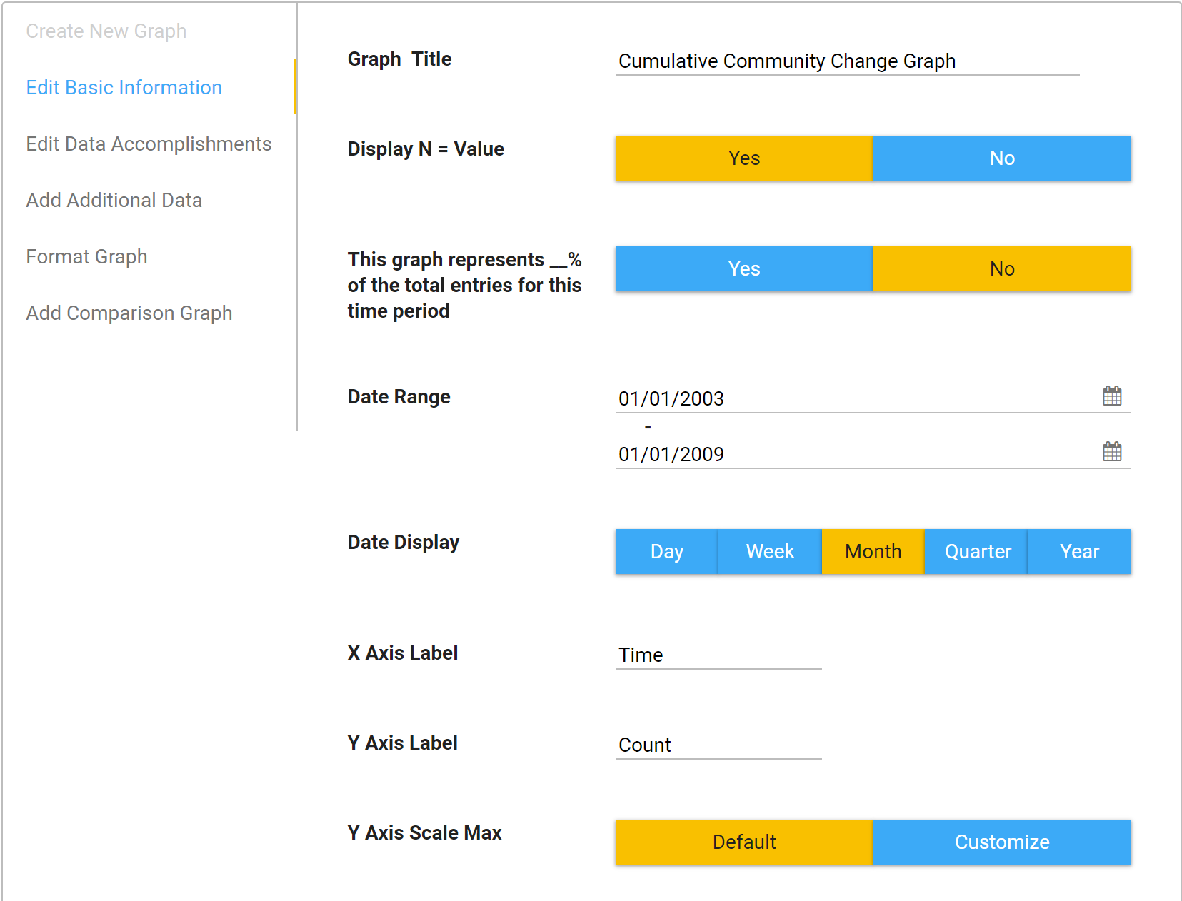
- Title: Update the title of the graph.
- Date Range: Adjust the range of data displayed by changing the dates shown.
- Note: the Date Range defaults to the current calendar year.
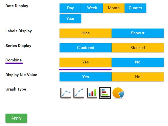
- Date Display: To review a broader or narrower view of data points throughout your date range, you can change the Date Display to reflect points by Day, Month, Quarter, or Year.
- X and Y Axis Label: Update the label for the X Axis and Y Axis as needed.
- If you want to remove the X and Y axis labels, leave them blank.
- Labels Display: Click Show # to display the data labels on the graph, or Hide to keep them hidden.
- Series Display: Click Stacked or Clustered depending on how you want to view your data.
- Graph Type: If you would like to view varying presentations of the data, you can modify the graph type by selecting from the Graph Type icons.
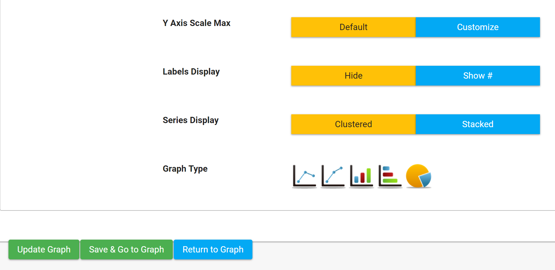
- When you are done making changes on this page click:
- Update Graph if you want to save and stay on this page.
- Save & Go to Graph if you want to save and go back to the graph.
- Return to Graph if you do not want to save changes.
Edit Data Accomplishments
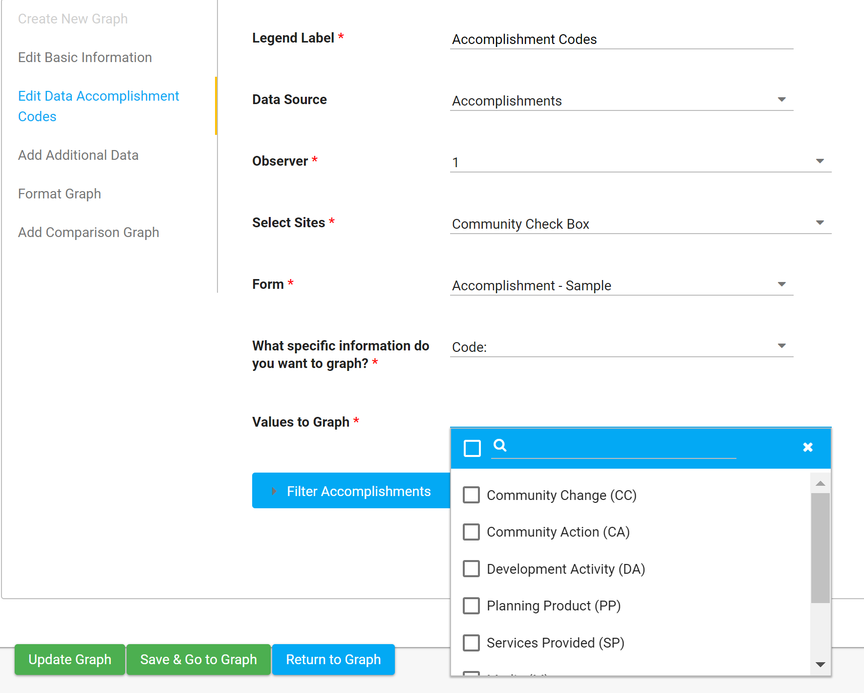
- Legend Label: Will default to the name of the data being graphed (e.g., Accomplishments, but you can change if needed. Legend field names should not be more than 30 characters to display correctly on the graph.
- Data Source: This is the source of your data (e.g., Accomplishments, Indicators, etc.)
- Observer: Select this if you want to select data from a particular observer.
- Observer 1: Primary Data (where all initial data for an Accomplishment should be entered)
- Observer 2: Reliability Scorer Data (also known as Secondary Scoring)
- Observer 3: Calibration Scorer Data (also known as Tertiary Scoring)
- Select Sites: If you have multiple CCBs within your site collection, select the site(s) you want to graph.
- Form: If you have multiple forms within your CCB, select the form you want to graph.
- What specific information do you want to graph? Select the specific question you want to graph.
- Values to graph: Example: if you select Code in the previous field, then you can select which codes to include in this field.
- The default is for all responses to be included, but you can edit that to one or more specific responses.
- Filter Accomplishments: If you want to apply filters, then select them here. If you don't see a specific question available to filter, please enable Apply Filter on the form's question under Administration.
- Generally, all dropdown, multiselect, numerical, and date fields are graphable and filterable. Text boxes and text lines are not, due to many variations in spelling, punctuation, etc.
- When you are finished making changes, click:
- Update Graph if you want to save and stay on the page.
- Save & Go to Graph if you want to save and go back to the graph.
- Return to Graph if you do not want to save changes.
Add Additional Data
- You can select from various data sources on your site to include additional data in your graph.
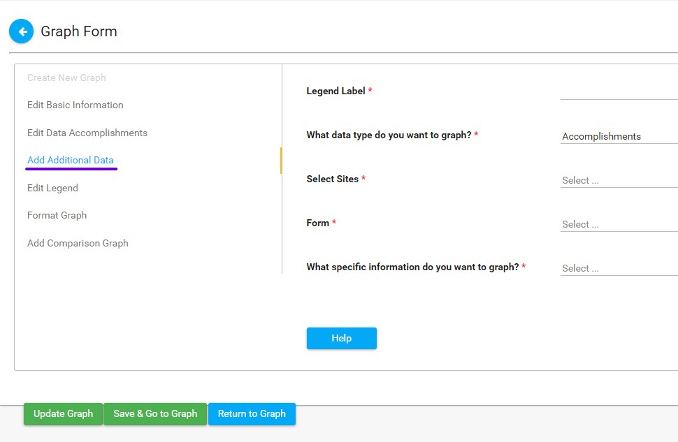
- Legend Label: Will default to the name of the data being graphed (e.g., Accomplishments, Participants Description, Indicators), but you can change if needed.
- Legend field names should not be more than 30 characters to display correctly and legibly on the graph.
- What data type do you want to graph? Select the data type you want to graph (e.g., Accomplishments, Participants Description, Indicators).
- Select Sites: If you have multiple CCBs in your site collection, select which CCB you want to graph.
- Form: If you have multiple forms within the CCB, select which form you want to graph.
- What specific information do you want to graph? Select the specific question you want to graph.
- When you are finished making changes, click:
- Update Graph if you want to save and stay on this page.
- Save & Go to Graph if you want to save and go back to the graph.
- Return to Graph if you do not want to save changes.
- Once you Add Additional Data to your graph, you'll see a new option beside your graph for "Combine."
- By default, this option is set to "Yes," combining the original data with the additional data for a sum of both in the visualization. Switch this to "No" (and Apply the change) if you would like to see your additional data featured separately on the graph. This is an ideal alternative for line and bar graphs, but not for pie carts.
Add Comparison Graph
- You also have the option to add a comparison graph. For instance, if you want to compare Accomplishments from this year to the previous year, you can choose last year's graph from the Select Comparison Graph drop-down menu and hit Save & Go to Graph. This will return you to the graph display, and you will see both graphs in tandem on the same page.
- Note: if you want to compare data within the same graph, use Add Additional Data instead.
Create Graph Template
- During the graph creation process, you may find you periodically build graphs with the same set of criteria, modifying a date range or some other minor adjustment. To help save time during this process, you can create a template from an existing graph.
- Open the existing graph that you want to use to create a template.
- Click Save as Template.
- Your new template graph will be saved in the Manage Templates folder and on the top level of your Graphs section.
- Click on + New Graph.
- You will see an option under What data type do you want to graph? that says Create Graph from Template.
- Select the template you wish to use from the dropdown list, then give your new graph a name.
- Note: All graphs in your CCB must have unique names. You will receive an error message if you attempt to duplicate a name.
- Click Create Graph.
- Modify the date range or any other adjustments you wish to make.